
5 Low-Cost Retail Store Design Upgrades That Drive Foot Traffic (2026)
5 retail store upgrades that cost as little as $0. Rearranging fixtures is free. A lighting refresh runs $100 to $300. Big results, small budget.

Foot traffic is rising. As of January 2026, mall visits are up 1.8% year-over-year, and average visit time has grown by 3.3%. Yet many retailers still spend heavily on full renovations to stay competitive. You do not need that level of investment.
Low-cost design upgrades can use shopper psychology much more effectively than a brand overhaul. Your window displays, lighting, layout, color choices, and entrance design all shape how people move through your store and decide what to buy.
1. Window Display & Strategic Lighting: Visibility Drives Conversion
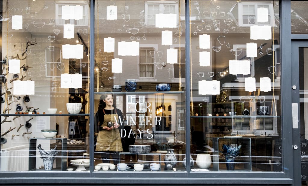
Your window functions as your most persuasive salesperson. Thirty-one percent of shoppers say the window display is the main reason they decide to enter a store. Another 41% rank window displays above every other visual merchandising tool. Despite this, many retailers treat their windows as secondary.
In practice, a passerby processes three layers of information in under 90 seconds: how good it looks, whether the products feel relevant, and whether the quality seems worth the price. A well-planned window that answers all three questions pulls people in far better than a generic, crowded display.
Start by removing visual clutter. Choose a single focal point that tells a clear story. Add targeted lighting, such as an LED strip under $50, to make products appear more valuable. Keep sight lines to the store open. When people can clearly see inside, psychological resistance drops, and conversion rates for foot traffic can rise by more than 30%.
Lighting matters throughout the store, not only at the window. For every 1% increase in dwell time, spending rises by about 1.3%. Good lighting encourages customers to stay longer and makes your merchandise look more appealing.
Details count. Warm lighting around 2700K encourages browsing and longer purchase decisions. Cooler, brighter lighting above 4000K pushes quicker, more impulsive buying. Use both types by zone. Aim for around 20 lumens per square foot in walkways and 50 to 70 lumens in merchandising areas. Many small retailers operate at only 15 to 20 lumens, leaving products in shadow and making the space feel flat.
Switching to LED bulbs and adding task lighting over key displays often costs between $100 and $300, yet it can lift sales by about 12%. Grocery stores that moved to LED reported sales gains of roughly 19%. Give fitting rooms special focus.
Poor lighting here stops purchases. When fitting room lighting flatters the customer, purchase likelihood can rise from 10% to 67%. You can often make this upgrade for under $100.
2. Store Layout: The Racetrack Effect
A well-planned layout can raise sales by 20% to 40%. The racetrack, or loop, layout does not require construction work. It relies on how you place fixtures and products.
The effect is behavioral. When shoppers do not see a clear path, they feel uncertain and leave more quickly. A racetrack layout creates a simple circular route that guides them past your main product zones without feeling pushy. Customers feel more comfortable, spend 15% to 20% more time in the store, and reach sections they would otherwise miss.
Place your high-margin items along this main path. The rule still applies: products at eye level sell about 50% more than items placed too high or too low. In a racetrack layout, this effect grows stronger because customers are already browsing more attentively.
Most people naturally turn right upon entering, then move clockwise. Place high-margin products on the right-hand side of the loop, especially near the entrance. Keep the main path wide and unobstructed. Aim for at least 6 feet in width so shoppers do not feel squeezed or blocked.
3. Color Psychology & the Entrance Zone
Coordinated color at the point of sale can raise purchase intent by about 38%. Seventy-one percent of shoppers say store design and visual cues are key factors in creating a positive experience.
Warm colors such as red, orange, and yellow create urgency and support impulse buying, which makes them useful for clearance zones and checkout areas. Cooler colors, such as blue and green, encourage more considered decisions, making them better suited for browsing sections. Research shows that 56% of consumers connect blue with trust, while 62% link green with health and sustainability.
Recent consumer research highlights the following patterns:
- Red encourages impulse buys and signals urgency. Use it for flash sales and limited-time promotions.
- Blue builds a sense of reliability for 56% of shoppers and still supports impulse buying, with 31% saying blue makes them more likely to purchase on the spot.
- Green signals health and environmental responsibility to 62% of consumers, making it a good fit for organic, natural, or eco-focused categories.
- Yellow and orange suggest energy and positivity and are common in fast-casual concepts that want to signal speed and efficiency.
Avoid painting the entire space in a single, intense color. Use color with intent. Give the entrance area one leading, welcoming color that shapes first impressions. Then vary colors by product zone so customers can navigate intuitively.
Signage also plays a key role. Traditional paint, business neon signage, and small accent signs can all highlight high-margin items and build a clear visual order. Repainting usually costs between $200 and $600. Updating signage can be folded into your normal refresh schedule at almost no extra cost.
4. Entrance Design: The First 15 Feet Decide Everything
Studies on shopper behavior show that the first 5 to 15 feet of your entrance, the decompression zone, strongly influences how long people stay and whether they buy. In this short stretch, customers are adjusting to the environment rather than actively shopping.
If you overload this zone with competing displays, you create mental fatigue before the visit even starts. The better approach is to keep this space open and simple. When customers have room to slow down, they become more willing to explore. One focused display, a clear message, or a welcoming visual element is more effective than several conflicting promotions.
Entrance lighting is critical. When light levels transition smoothly from outdoors to indoors, the space feels more comfortable, and fewer shoppers turn around. Transparency also helps. Clear sight lines and wide doorways reduce psychological barriers and can increase foot traffic conversion by more than 30%.
Use the first 10 feet as a welcome zone with minimal product. Then use feet 5 through 15 as the bridge into your main product areas. Place a few strong, well-lit displays that feel like invitations rather than pressure.
5. High-Margin Product Placement: Adjacency & Visibility
Items placed at eye level are noticed about 70% more often than products on lower shelves. If your highest-margin goods sit too high or too low, you may be losing 20% to 30% of potential margin right away.
Thoughtful product adjacency, placing related items together, supports larger baskets. When customers can complete a full task in one area, they tend to buy more.
For example, a skincare routine displayed in order, such as cleanser, serum, and moisturizer, at eye level, in warm lighting, with clear pricing, will prompt more impulse purchases than if these items are scattered. Checkout areas can extend this effect by rotating a mix of small, high-margin items that change with the season or promotions.
Why This Matters Now: The 2026 Retail Advantage
These five upgrades cost relatively little. Window redesign often ranges from $200 to $500. Lighting improvements usually fall between $100 and $1,500. A racetrack layout relies on rearranging fixtures, so it is free. A color refresh can cost $50 to $200. Clearing and reshaping your entrance zone also costs nothing.
Together, these changes can be powerful. Retailers that apply them report conversion rate gains of 15% to 40%, dwell time increases of 20% to 30%, and average transaction value growth of 10% to 25% within 60 to 90 days.
Strong performance in 2026 does not depend on higher spending. It depends on focused design choices grounded in behavioral science. As mall traffic continues to rise and shoppers seek more intentional in-store experiences, retailers who implement these low-cost design upgrades will attract a larger share of visits and capture more revenue from every customer who walks through the door.
About the Creator
Neon Designs
Neon Designs brings you stunning neon signs to light up any space. Choose from our ready-made collection or let us create a custom neon sign just for you.
Keep reading
More stories from Neon Designs and writers in Journal and other communities.
Wedding Industry Expert Reveals: Neon Signs Are Now Essential to Modern Wedding Photography – Here's Why 87% of Engaged Couples Are Choosing Them
Wedding planning is shifting in a real way. Couples are spending an average of $32,000 on their celebrations this year, and something significant is happening: neon signs have moved from a nice-to-have accent to an expected part of the wedding backdrop. The global wedding decoration market is projected to hit $25.74 billion by 2033, with custom neon signs becoming a major piece of that category.
By Neon Designs5 months ago in Futurism
Author’s Advice
If you would’ve asked me 20 years ago did I know I’d become a writer and an author, I would’ve said “nope, ain’t happening”. As fate would have it I did become an author and I can honestly say I’m loving it so far. It really does feel good to be a writer. I’ve learned a lot on this journey and I feel like with even me being as new to this world as I am, there’s some wisdom I need to share with every other aspiring author.
By Joe Patterson20 days ago in Journal
Day 31 of the Iran War: Gulf in Blood, Houthis Open New Front
Analysis Malik Sarfaraz Hussain Awan, March 30, 2026: Friends, analysts and international media viewers, today the situation in the Middle East has reached a very dangerous point and it is no longer just a war between Iran and Israel, but the entire Gulf, the Red Sea and the global energy supply lines have become entangled together, where the 31st day of "Operation Roaring Line" has witnessed intense operations on multiple fronts, and Iran directly targeted the Gulf countries with missiles and drones on a military camp in Kuwait, in which 10 Kuwaiti soldiers were injured, while the Emirates Global Aluminum Plant in the United Arab Emirates and the Al-Baha Factory in Bahrain were also attacked, which the Arab League has strongly condemned and Iran has given a clear message that whoever supports the United States and Israel will also be targeted. Meanwhile, the Houthis in Yemen have fired ballistic missiles and drones at southern Israel, blaring sirens as far as Haifa Port, and have announced that their operations will continue until the attacks on Iran and the axis of resistance stop. Which is a new serious threat to the Red Sea and the Bab al-Mandab, while on the other hand, the IDF has carried out more than 140 attacks on Iranian missile and drone production sites, including Tehran, and US forces have targeted Iranian command centers, as well as deployed 3,500 additional Marines to the region through the Pentagon, and planning is underway for a possible operation on Iran's main oil export hub, Kharkiv Island. Regarding important statements and contradictions, President Trump made the explosive claim on Air Force One that regime change has occurred in Iran, the leaders have disappeared, and the military has been weakened, and warned that if a deal is not made, Iran's energy facilities and oil wells will be completely destroyed. While the Iranian Foreign Ministry has described this US offer as unrealistic and excessive, it has vowed to respond with full force against a ground attack. And although Saudi Arabia, the UAE, Qatar, and Bahrain have condemned Iran's attacks, they are privately worried about the economic losses of the war because this war is now limited to limited attacks. It has escalated into a full-scale regional conflict and the entry of the Houthis is seriously threatening Red Sea shipping, and the biggest game changer is the arrival of thousands of US Marines and the possible occupation of Kharkiv Island, which will severely affect global oil supplies and lead to an energy crisis in Europe and Asia. So the biggest question now is whether there will be a ceasefire by the April 6 deadline or a ground operation on Kharkiv Island will start and set the entire region on fire. And my final thought is that the continuation of this war is now changing the geopolitical map of the region. If there is no ceasefire by the April 6 deadline, a possible US operation on Kharkiv Island will not only paralyze Iran’s economy but could also cause a 20-25% reduction in global oil supplies. China, which is Iran’s largest oil buyer, cannot tolerate this situation and is increasing diplomatic pressure through the Shanghai Cooperation Organization, together with Russia. Pakistan, a long-standing ally of the Gulf states on one hand and a direct neighbor of Iran on the other, is now in a most delicate position. Islamabad’s policy of neutrality is commendable, but if the war spreads further, Pakistan’s oil imports, remittances, CPEC projects and border security will all be at risk. Should Pakistan now play an active diplomatic role? Can regional countries make Pakistan a platform for mediation? These questions are a major test not only for Pakistani foreign policy but also for the entire Islamic world. If today’s silence becomes tomorrow’s big price, history will not forgive us.
By Malik Sarfraz Hussain Awana day ago in Journal
You Should Stop Trying to Be a Better Person
A year ago, I spent two days in the Colombian mountains drinking ayahuasca as part of a spiritual ceremony. An experience that pulled apart every detail of my being and rearranged me in a new sequence. I wish that life became easier after the feat. It didn’t.
By Annaise Michelle8 days ago in Humans


Comments
There are no comments for this story
Be the first to respond and start the conversation.